| Patient ID: | p006_OSC3 |
| Age: | 47 |
| Gender: | M |
| Cancer Description: | ovarian high-grade serous carcinomas |
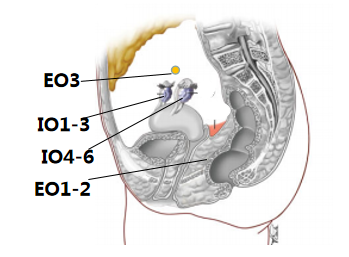
| Sample Location: | Right ovary and Omentum and Peritoneum and Omentum |
| Tumor Stage: | IIIC |
| TNM Stage: | T3cN1M0 |
| Treatment: | Three of the four were naпve ovarian cancer patients who had not received neoadjuvant chemotherapy, whereas one patient was treated with neoadjuvant chemotherapy before tissue collection. |
| Tumor Purity: | >=70% in tumor and >30% in ascite; Text statement:Two pathologists selected areas with rich tumour cell populations (at least 70%) which were subsequently used in the study. The pathologists identified that the tumour contents in the pellets were at least 30%. |
| Sample Sequencing: | Whole exome sequencing |
| PMID: | 27741368 |
| Data Sources: | Table S5-S8 |
| Journal: | J Pathol |
| Published: | 2017 Jan |
| Sequencing Platform: | Illumina HiSeq2500 |
| Pipeline/Software: | align:BWA; GATK,Picard; Samtools; mutations and indel:Mutect,Indelocator; annotation:ANNOVAR; |
в—ҸThe samples from a single patient are used to generate phylogenetic tree.в—ҸThe schematic diagram is adapted from the original figure in the article.
в—ҸTrunk mutation: Alterations shared by all samples/regions, possibly occurred early in tumorigenesis. в—ҸBranch mutation: Alterations shared by a subset of samples or regions, possibly occurred later in tumorigenesis. в—ҸPrivate mutation: Alterations present in only one sample/region of the tumor, possibly occurred later in tumorigenesis. в—ҸBranch lengths are proportional to the number of mutations separating the branching points. в—ҸPotential driver genes/mutations are mapped along the tree if available.


в—ҸSomatic mutation landscape of cancer related genes in the study.в—ҸEach row represents one patient; each column represents one cancer gene.в—ҸThe heat map indicates the presence and classification of a mutation or its absence (gray) in each patient.
-log10(P)
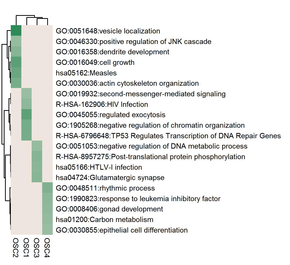
в—ҸHeatmap of the top enrichment clusters, generated by the trunk mutation gene list of each patient in the study.в—ҸEach row represents one cluster; each column represents one patient.в—ҸThe discrete color scale represents statistical significance.
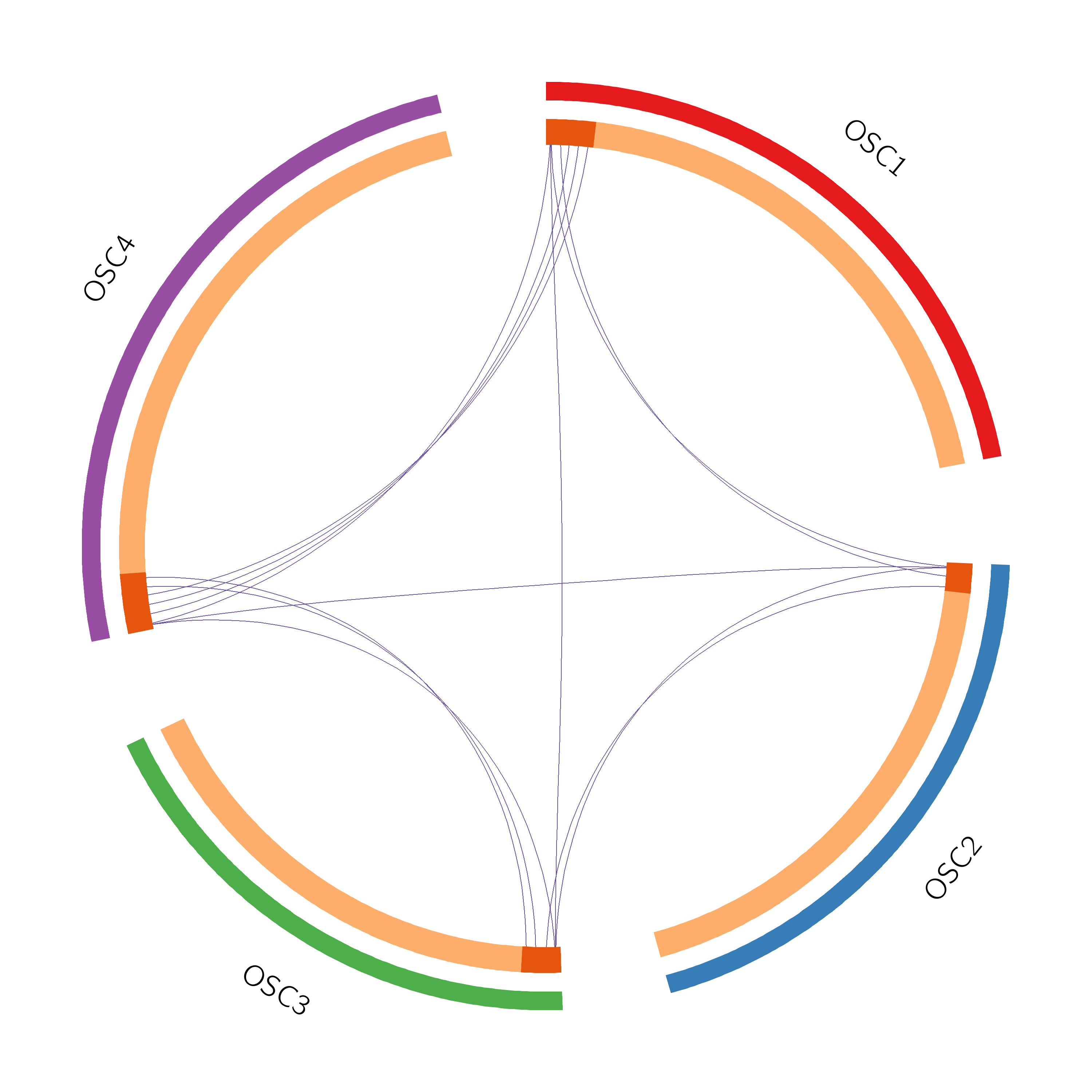
в—ҸThe Circos plot shows the functional overlaps of genes that share the same ontology term.в—ҸThe arc annotation is the same as in the left Circos plot.в—ҸBlue lines link the different genes where they fall into the same ontology term.
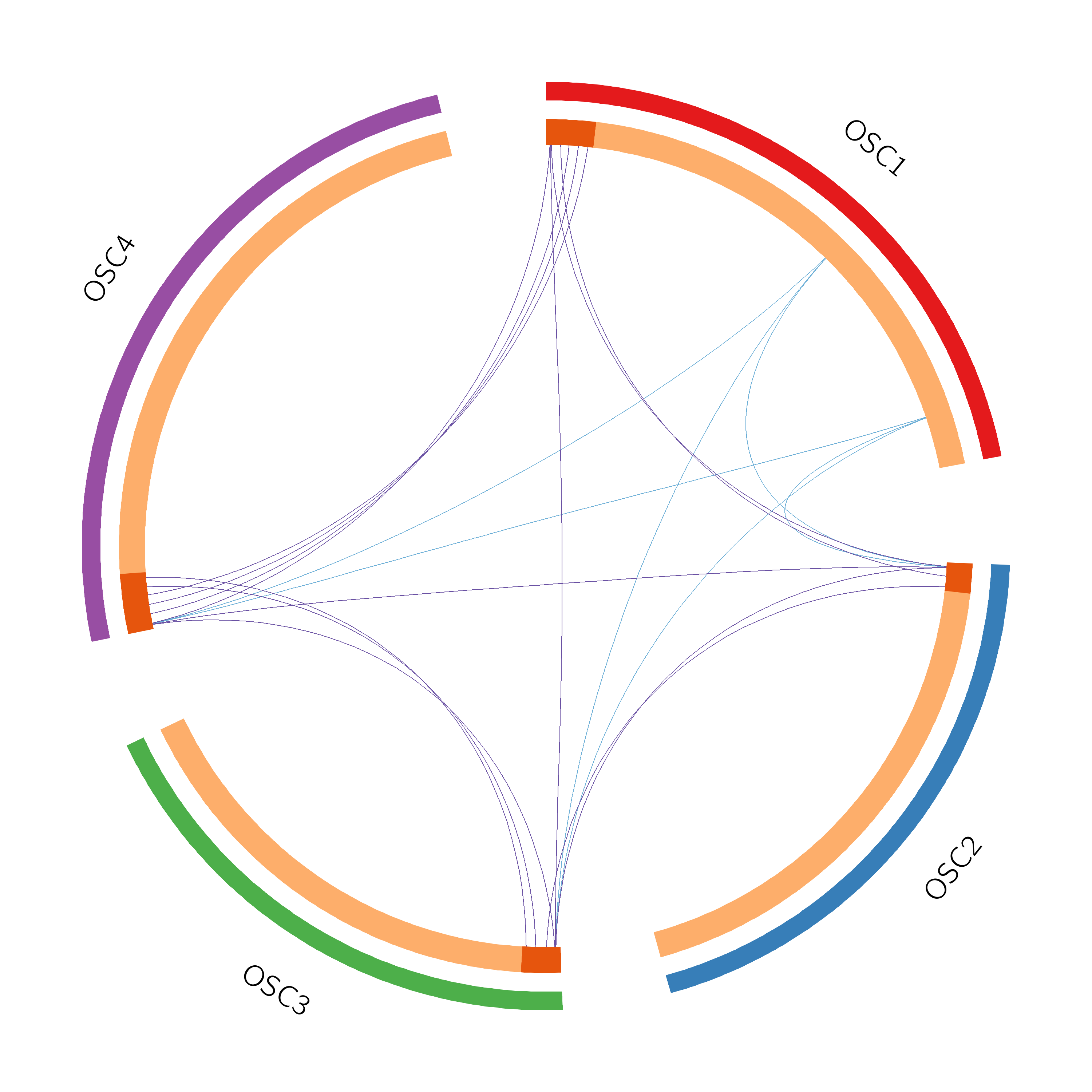
в—ҸThe Circos plot shows the overlap of the trunk mutation gene list of each patient.в—ҸEach outside arc represents the identity of a gene list; each gene is represented as a spot on the inside arc.в—ҸFor the inside arc, dark orange represents the genes that appear in multiple lists; light orange represents the genes that are unique to that gene list.в—ҸPurple lines link the same gene that shared by multiple gene lists.
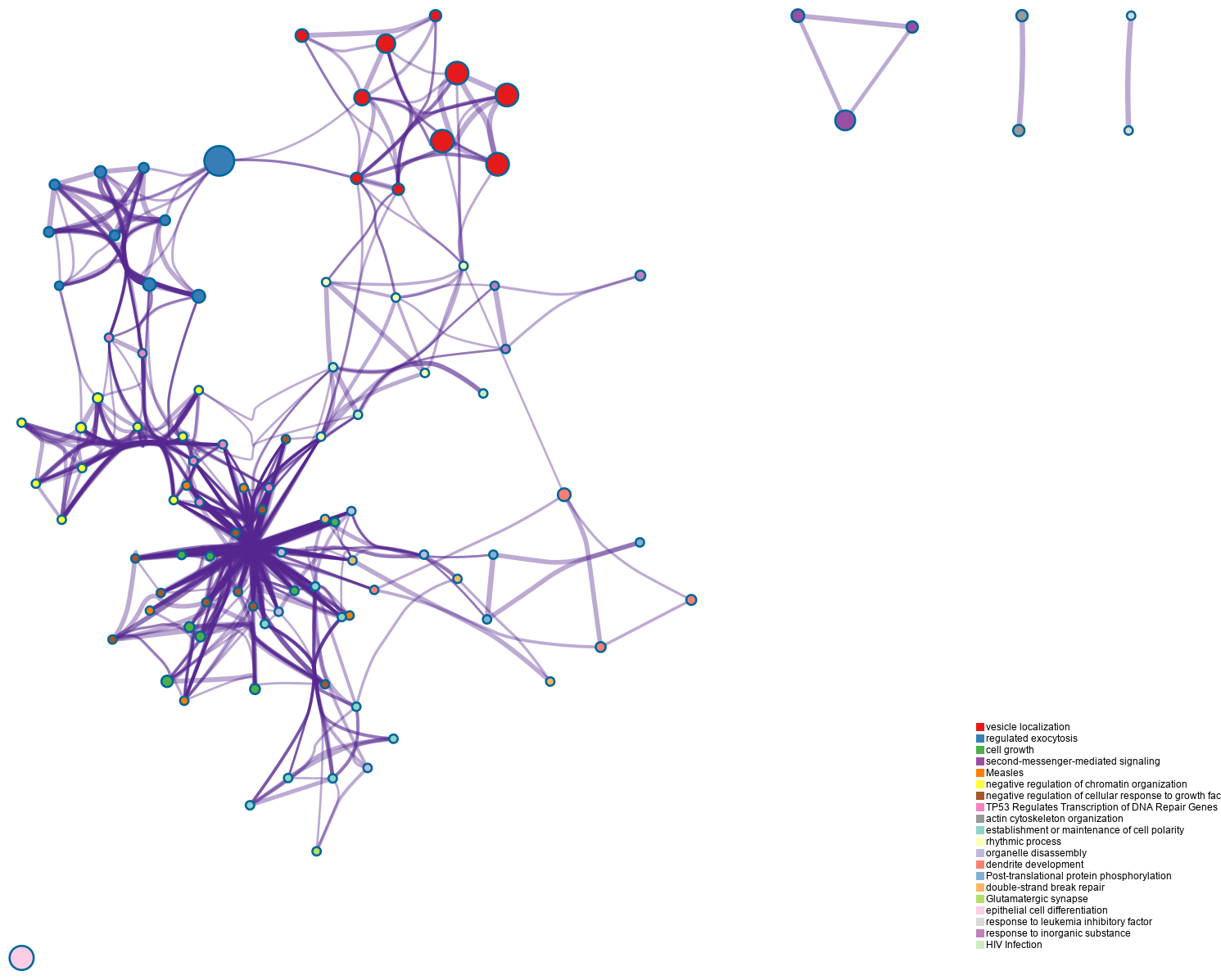
в—ҸEnrichment network visualization for results from the multiple trunk mutation gene lists in one study.в—ҸEach term is represented by a circle node, where its size is proportional to the number of input genes fall into that term, and the color represents its cluster identity.в—ҸThe edge links terms with high similarity; the thickness of the edge represents the degree of similarity. в—ҸClick the picture, more details of the network by cluster can be illustrated.
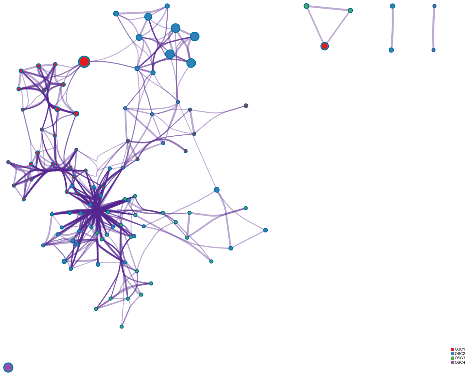
в—ҸThe same enrichment network as the above network figure, and has its nodes displayed as pies.в—ҸEach pie sector is proportional to the number of hits originated from a gene list.в—ҸThe color code represents the identities of trunk mutation gene lists.в—ҸClick the picture, more details of the network by counts can be illustrated.