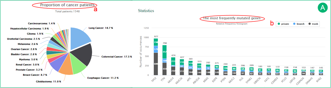
A.  The pie chart shows the proportion of cancer patients included in CancerTracer.
  The histogram illustrates the most frequently altered genes and their regional distributions. The trunk, branch and private mutations are represented in gray, blue and green, respectively.
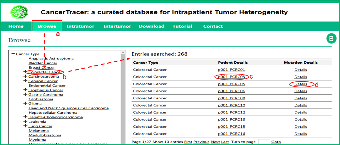
B. The interface of browse by cancer type . Click the specific cancer type, and the results will be shown in a table in the right frame.
  Click the patient details to get more details about the sample.
  Click the mutation details to get the complete mutation dataset of the cancer type.
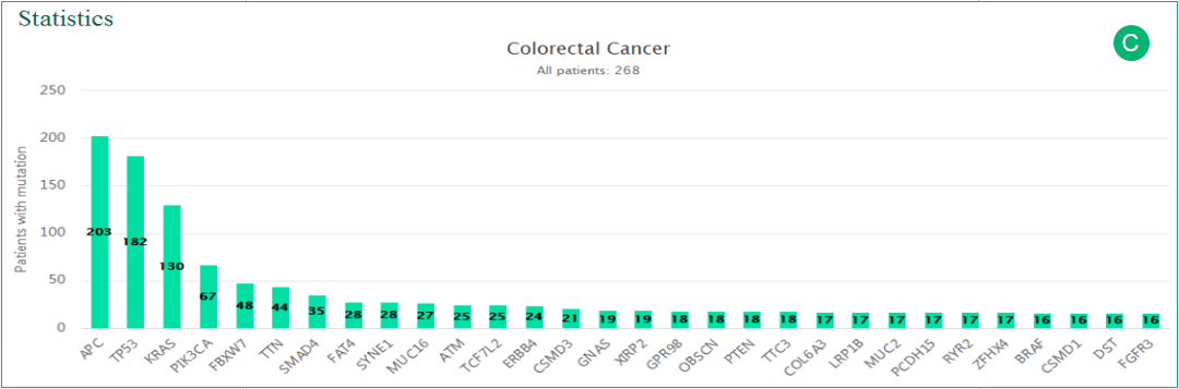
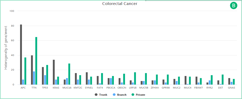
C. The histogram is related to panel B. The most frequently altered genes in the cancer type are represented in the histogram.
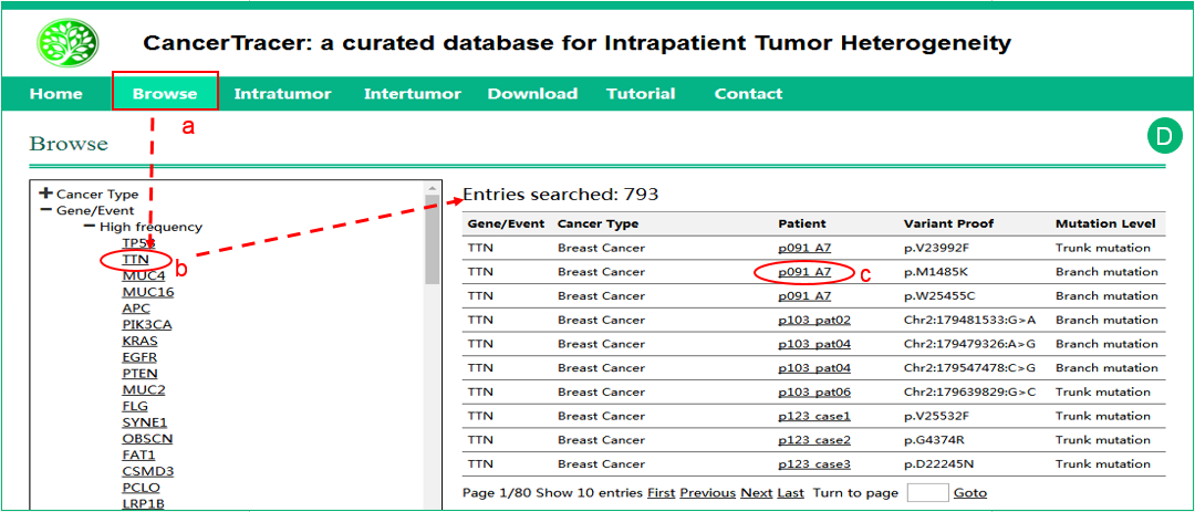
D. The interface of browse by Gene/Event. Click the specific gene or event, and the results will be shown in a table in the right frame. Click the patient details to get more details about the sample. The details of the variation and the mutation level are also shown in the table.

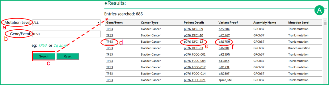
A. The interface of search intratumor heterogeneity data in a specific cancer type. There are two options in Heterogeneity selection box: spatial and temporal heterogeneity, which represent different sampling strategies. For users only focus on known cancer genes, ‘Cancer Gene Census’ (cancer-related genes annotated in the COSMIC database) can be selected in the ‘Gene Type’ selection box, instead of ‘All’. The result table presents data in patient-level, and provides lists of affected genes and links to individual patient data.
B. The histogram illustrates the heterogeneity distribution of all gene mutations in a cancer. The trunk, branch and private mutations are represented in gray, blue and green, respectively.
C.
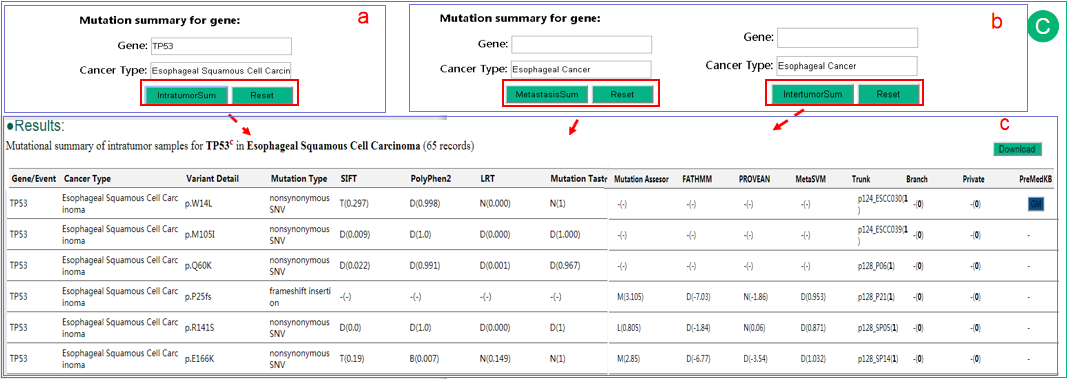
In the result of intratumor searching page, mutation summary of gene can be searched for all cancer types as default or in one cancer type. Moreover, in the result of intertumor searching page, mutation summary of gene in metastasis is also provided. The summary results are shown in a new page. We mainly provide summary statistics for mutations that potentially affect gene function, such as missense, stop-gain, indels et al. User can easily observe the mutations affected a lot of patients (number in parentheses indicates affected patients), cancer types (for each patient) and mutation levels. We also provide SIFT and Polyphen2 and several additional annotations with both predictions and their scores in parentheses. A '-' mark indicates data not available.
In the intertumor heterogeneity data search page, heterogeneity data can be searched by cancer type. In this case, the options of heterogeneity type are classified as primary-metastasis and primary-multimetastasis.
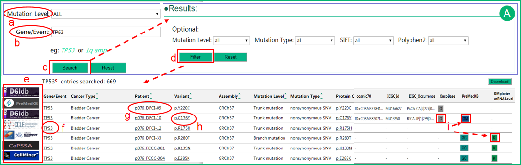
A. The interface of search intratumor heterogeneity data by gene or event. Users can select different mutation levels in the selection box, including trunk, branch and private, which may indicate the time of occurrence of the mutation during tumor evolution. The Gene/Event input box suggests plausible gene or event names and supports auto-completion. The results are shown in a table that lists the related information of the queried gene/event. User can sort the results using sort function embed in several columns. Optional criteria can be chosen to filter the result data.  The linkage of the gene to DGIdb, PreMedKB or Nature Score database provide potential links between genes/mutations with drugs or small molecules. CCLE and GDSC are key pharmacogenomics (including resistance and sensitivity) databases. CaPSSA enables visual evaluation of cancer biomarker genes for patient stratification and survival analysis using mutation and expression data. The link to CellMiner which provide analyzing service based on NCI-60 data is also provided.
  The gene name is linked to COSMIC database for details.
  Click patient details will open a new page that displays detailed patient-level information.
  Variations that lead to amino acid change are linked to COSMIC database.
  In addition, several buttons are provided. Button O linked to the pages of OncoBase querying by gene&mutation. Button GC/GM/GMC linked to the pages of PreMedKB querying by gene&cancer type, gene&mutation or gene&mutation&cancer type, respectively. Button K linked to Kaplan-Meier Plotter if the cancer type is available in KMplotter. These buttons will undergo dynamic check for data availability after complete load of webpage. Only those may be informative (with network) will be preserved. The table contents can be downloaded by clicking "download" button.
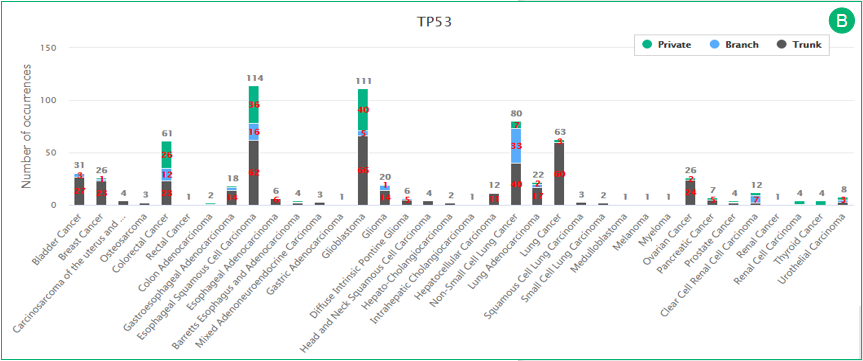
B. The histogram illustrates the regional distributions of all gene mutations in different cancer types. The trunk, branch and private mutations are represented in gray, blue and green, respectively. The diagram will automatedly update after applying filters.
In the intertumor heterogeneity data search page, heterogeneity data can also be searched by gene or event. The result pages are similar to intratumor searches.
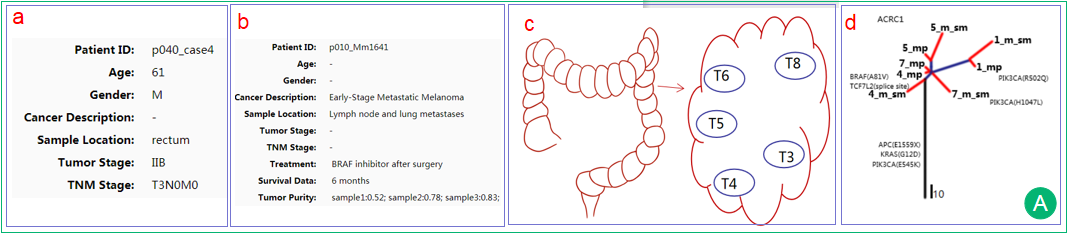
A. The interface demonstrates clinical information of the patient, which was collected from the literature. The interface displays the information of the literature including PubMed ID, publication information, sequencing platform and processing pipelines. Treatment data, survival data and tumor purity are also displayed if available. Users can may assess the data quality and trace the data back to the original literature.
The schematic diagram of sampling points. It was adapted from the original figure in the literature if available.The patient-specific phylogenetic tree is generated by multiple samples from the single patient and reveals the spatial or temporal composition or the evolutionary trajectory of subclones. The trunk is represented in black and indicates alterations shared by all samples/regions, possibly occurred early in tumorigenesis. The branches are represented in blue and indicate alterations shared by a subset of samples/regions, possibly occurred later in tumorigenesis. The leaves are represented in red and indicate alterations present in only one sample/region of the tumor, possibly occurred later in tumorigenesis. Branch lengths are proportional to the number of mutations separating the branching points.
B. The heatmap shows the regional distribution of gene mutations in different patients. Each row represents one patient and each column represents one cancer gene. The trunk, branch and private mutations are represented in black, blue and red, respectively. The absence of a mutation is represented by gray.
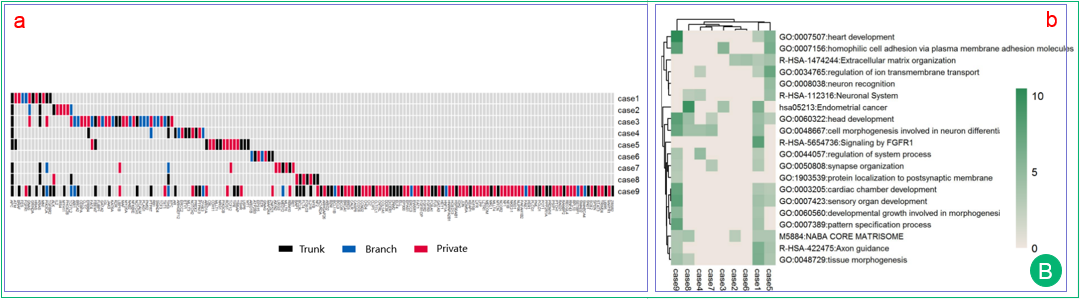
Heatmap of the top enrichment clusters. It is generated by the genes with trunk mutations of each patient in a study. An online analysis tool named Metascape is used to perform gene list analysis and provides multiple analyses results. Each row represents one cluster and each column represents one patient. The discrete color scale represents statistical significance of enrichment test (p value).
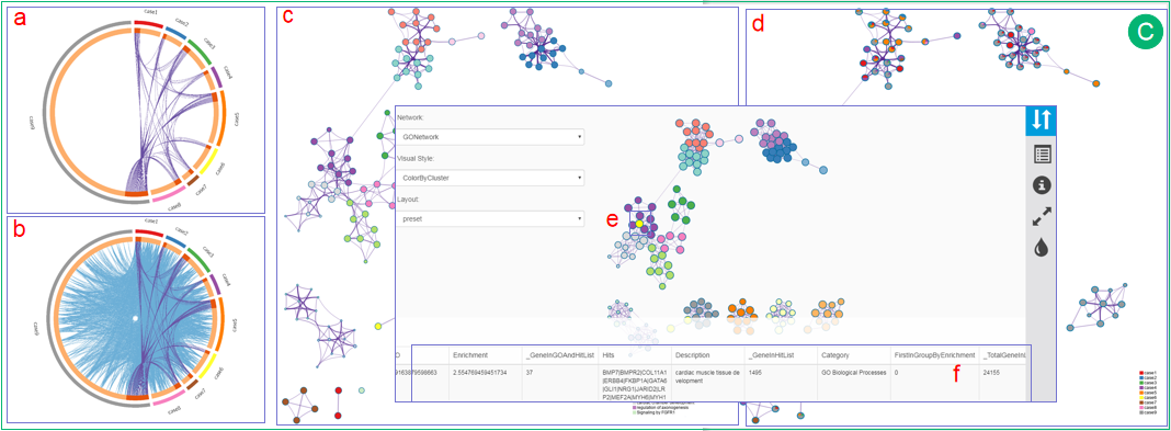
C. The Circos plot shows the overlap of the trunk mutation gene list of each patient. The outside arc represents the identity of a gene list, while each gene is represented as a spot on the inside arc. On the inside arc, dark orange represents the genes that appear in multiple lists and light orange represents the genes that are unique to that gene list. Purple lines link the same gene that shared by multiple gene lists.
The Circos plot shows the functional overlaps of genes that share the same ontology term. The arc annotation is the same as in the Circos plot of panel a. Blue lines link the different genes where they fall into the same ontology term. The top 20 most enriched clusters for a study are presented as network with different coloring strategies.
In one form, same color is applied to similar terms. Each term is represented by a circle node, where its size is proportional to the number of input genes fall into that term, and the color represents its cluster identity. The edge links terms with high similarity; the thickness of the edge represents the degree of similarity.
In another form, each term is represented by a pie chart. The areas in each pie are proportional to the number of hits originated from a gene list. The color code represents the identities of trunk mutation gene lists. Clicking on each of them will direct users to an interactive network view. Users can select one or more nodes by SHIFT+clicking interested nodes. At the bottom of this page, a table will provide rich information of selected nodes, including term description, related genes and p value in log10 scale.