| Patient ID: | p082_p1 |
| Age: | 50 |
| Gender: | F |
| Cancer Description: | - |
| Sample Location: | Multi-region in Rectum |
| Tumor Stage: | I |
| TNM Stage: | - |
| Tumor Purity: | sampleA:0.32; sampleB:0.26; sampleC:0.25; sampleD:0.49; Software: Sequenza |
| Sample Sequencing: | Whole exome sequencing |
| PMID: | 29169336 |
| Data Sources: | Table S5,Fig.1 |
| Journal: | BMC Cancer |
| Published: | 2017 Nov 23 |
| Sequencing Platform: | Illumina Hiseq4000(100X) |
| Pipeline/Software: | Align:BWA; sorted and indexed:Samtools 0.1.19; GATK 1.6 and multiSNV; markDuplicated:Picard(1.76); Phylogenetic trees:MEGA5:SCNA; Sequenza R package 2.1.1; |
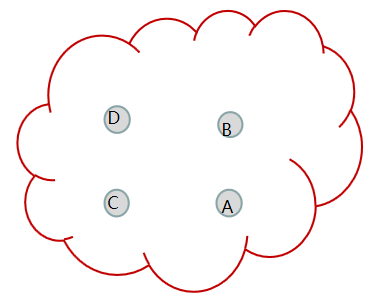
●The samples from a single patient are used to generate phylogenetic tree.●The schematic diagram is adapted from the original figure in the article.
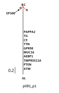
●Trunk mutation: Alterations shared by all samples/regions, possibly occurred early in tumorigenesis. ●Branch mutation: Alterations shared by a subset of samples or regions, possibly occurred later in tumorigenesis. ●Private mutation: Alterations present in only one sample/region of the tumor, possibly occurred later in tumorigenesis. ●Branch lengths are proportional to the number of mutations separating the branching points. ●Potential driver genes/mutations are mapped along the tree if available.


●Somatic mutation landscape of cancer related genes in the study.●Each row represents one patient; each column represents one cancer gene.●The heat map indicates the presence and classification of a mutation or its absence (gray) in each patient.
-log10(P)
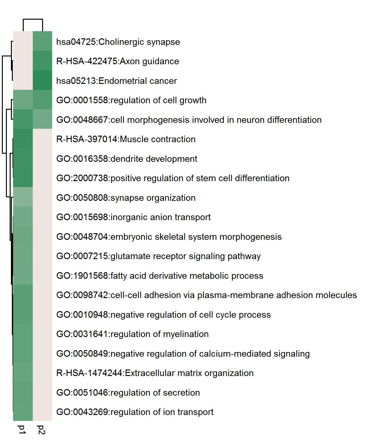
●Heatmap of the top enrichment clusters, generated by the trunk mutation gene list of each patient in the study.●Each row represents one cluster; each column represents one patient.●The discrete color scale represents statistical significance.
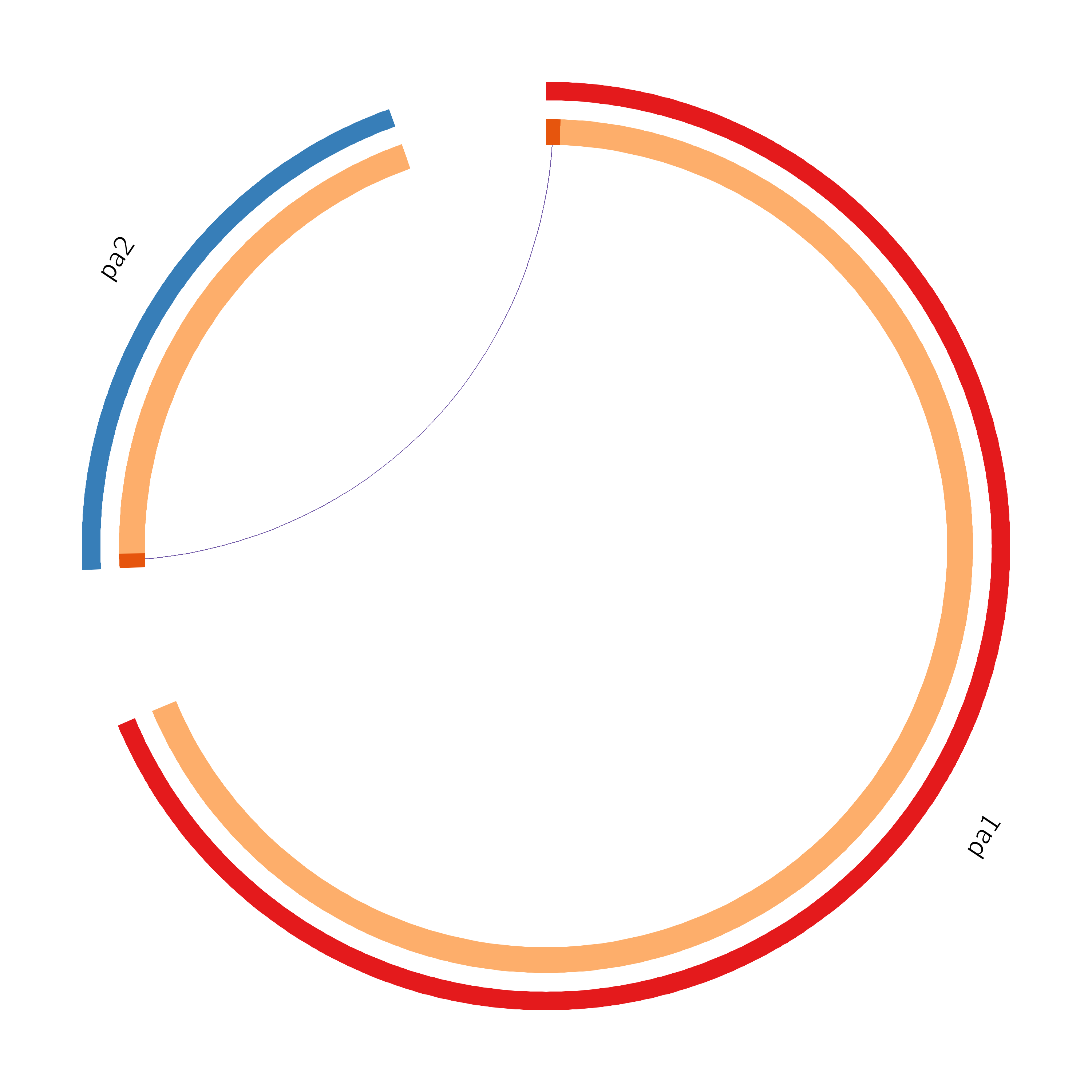
●The Circos plot shows the functional overlaps of genes that share the same ontology term.●The arc annotation is the same as in the left Circos plot.●Blue lines link the different genes where they fall into the same ontology term.
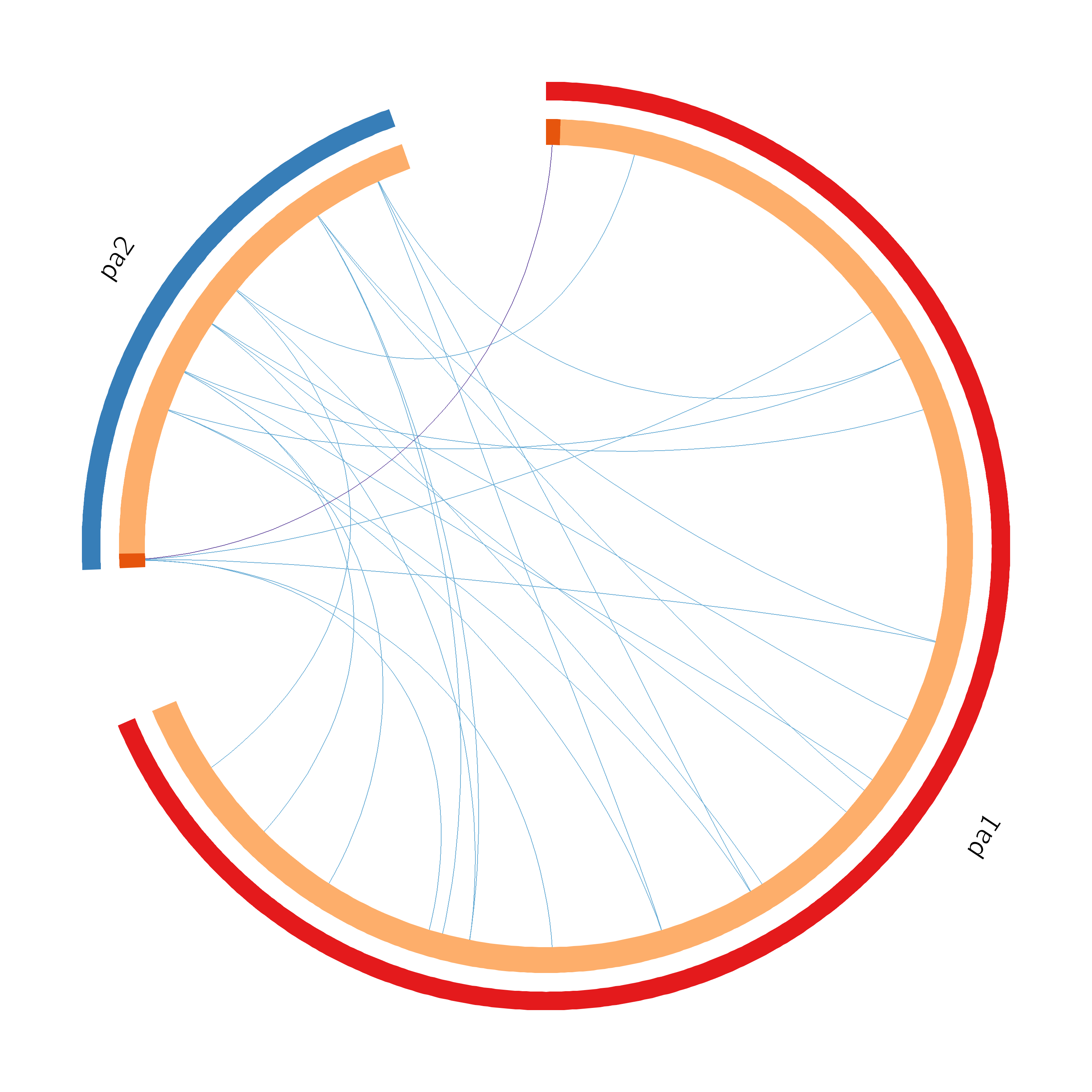
●The Circos plot shows the overlap of the trunk mutation gene list of each patient.●Each outside arc represents the identity of a gene list; each gene is represented as a spot on the inside arc.●For the inside arc, dark orange represents the genes that appear in multiple lists; light orange represents the genes that are unique to that gene list.●Purple lines link the same gene that shared by multiple gene lists.
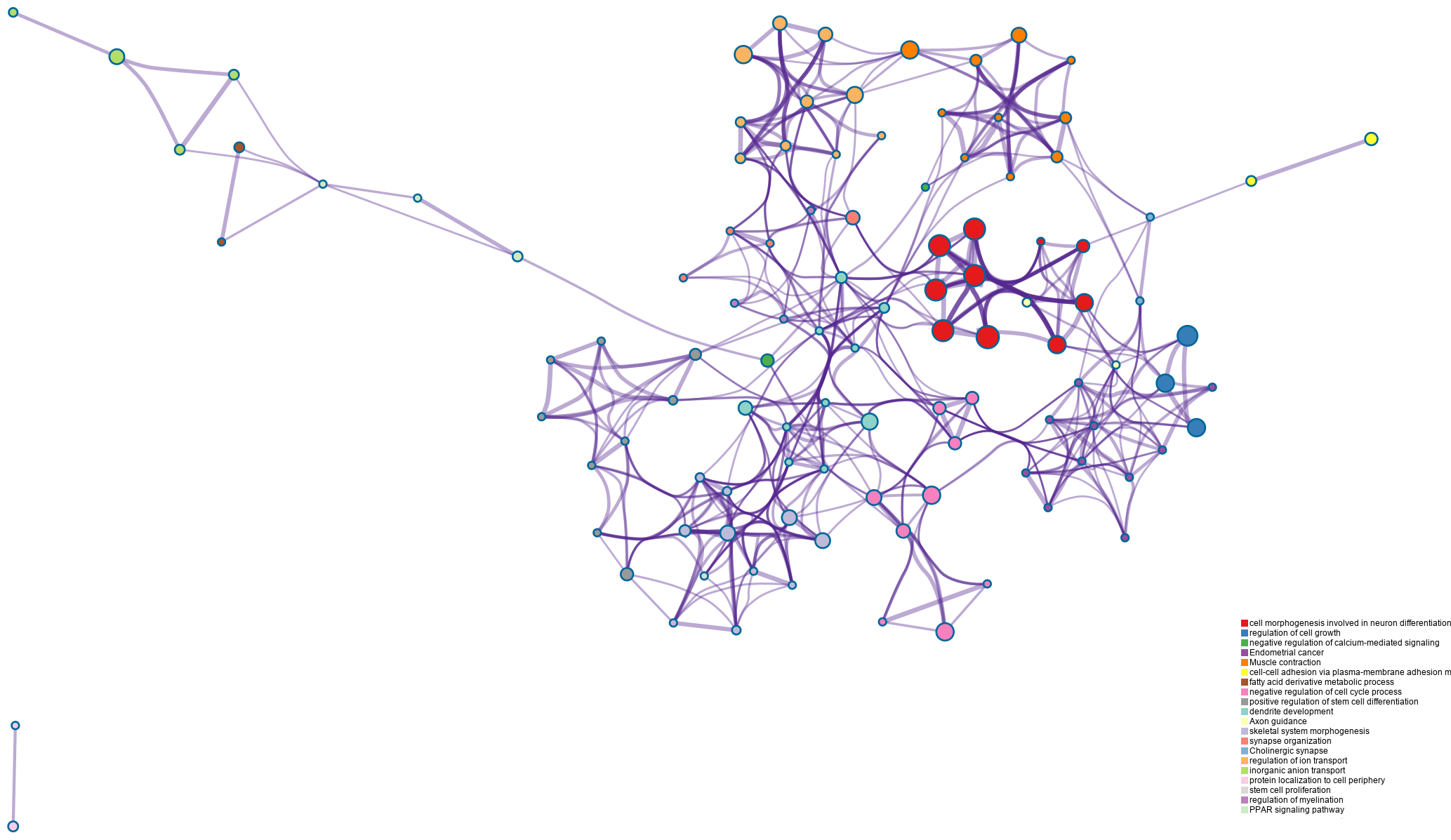
●Enrichment network visualization for results from the multiple trunk mutation gene lists in one study.●Each term is represented by a circle node, where its size is proportional to the number of input genes fall into that term, and the color represents its cluster identity.●The edge links terms with high similarity; the thickness of the edge represents the degree of similarity. ●Click the picture, more details of the network by cluster can be illustrated.
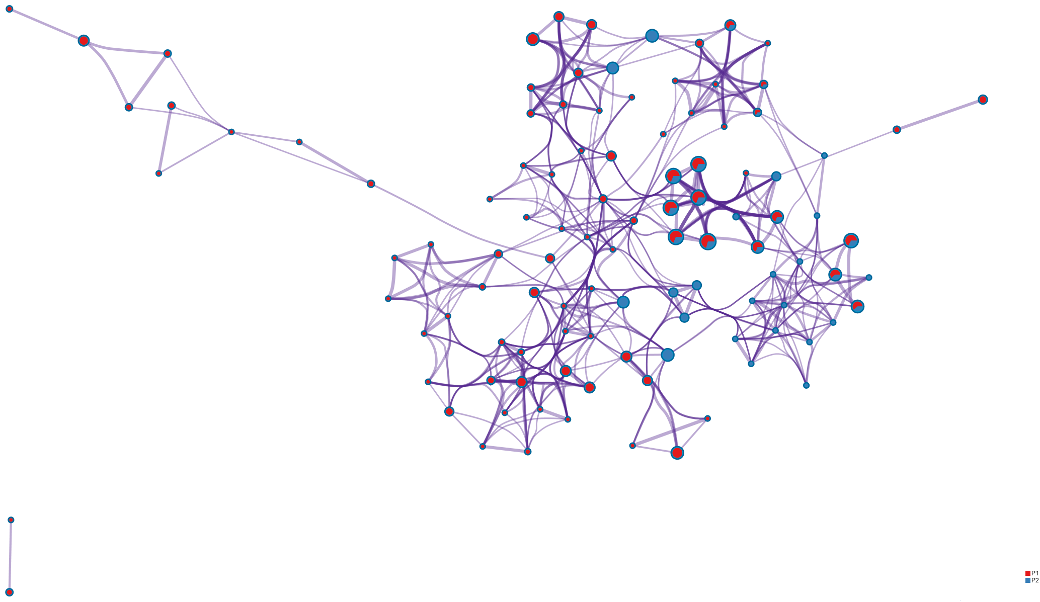
●The same enrichment network as the above network figure, and has its nodes displayed as pies.●Each pie sector is proportional to the number of hits originated from a gene list.●The color code represents the identities of trunk mutation gene lists.●Click the picture, more details of the network by counts can be illustrated.