Tutorial
Basic search
This database mainly provide gene-level search. Users may browse genes in Browse page and reach the gene result page with one click on the gene of interest. Alternatively, users can search a gene or miRNA in the Search interface.
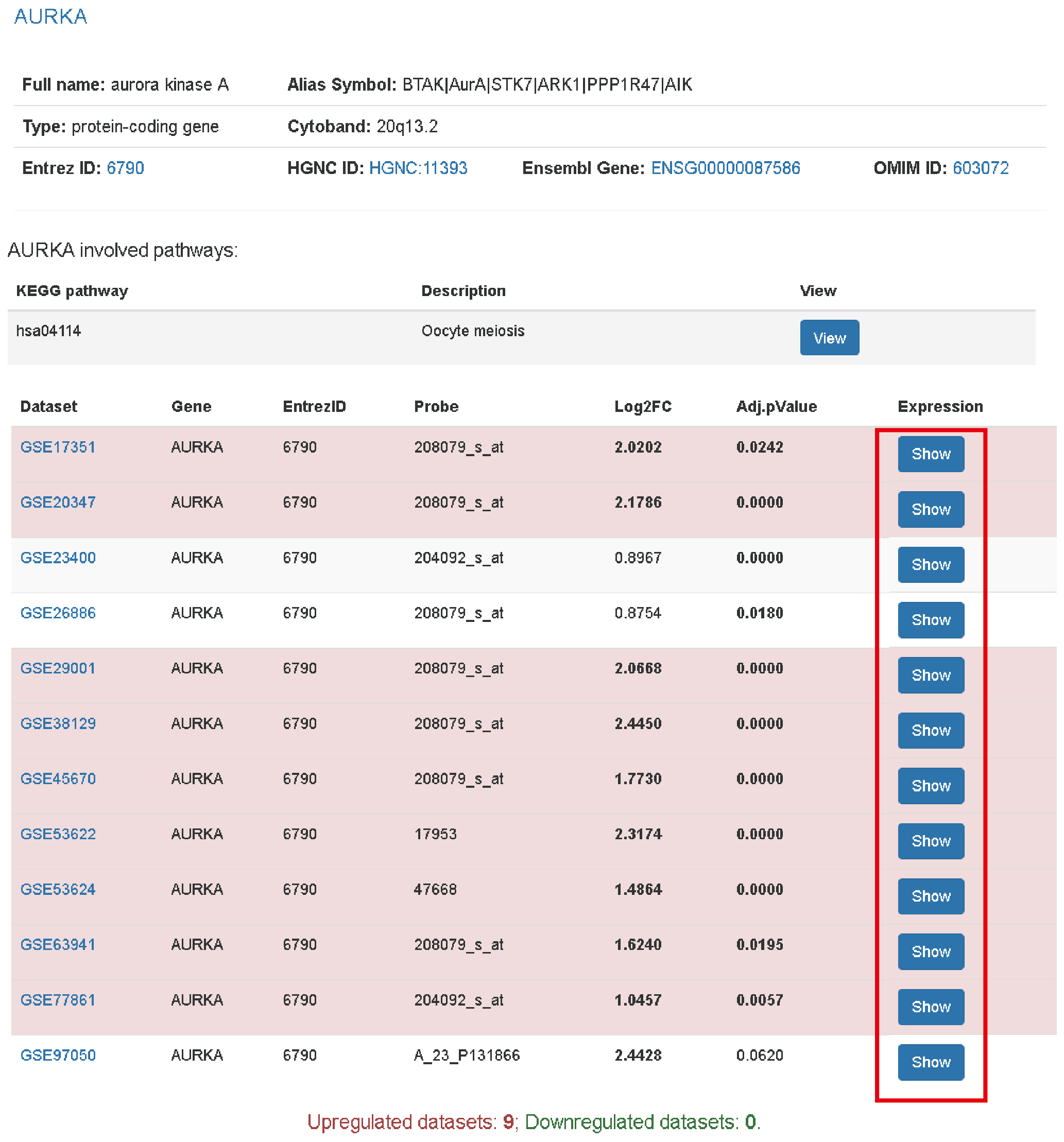
The result page shows basic information and expression changes of gene/miRNA across datasets. The row with significant expression change of the gene will be marked with red (over expression) or green (down expression). The threshold is |log2(Fold change)| >= 1 and adjusted p value < 0.05. To view the expression level of a dataset, user can click the view button which will present a boxplot of gene expression between tumor and normal.

The following parts are Kaplan Meier plots from three datasets if possible and copy number changes across datasets. Similar to gene expression panel, clicking the view button in CNV panel evokes an interactive barplot to show the log2ratios of each tumor sample in a dataset.

We also provide gene mutation plots and a list of highly correlated genes. In this page, we just provide a representative mutation plot of a transcript for a gene. For all the affected transcripts, clicking the link on here will open a new page to show the mutation plots.

Analyzing highly correlated genes
At the bottom of highly correlated gene list, there is a link provide interface to gene correlation analysis. Clicking here link (A) will open a new page that allow apply filters to correlated genes. Currently supported filters: mean Pearson correlation coefficient (PCC), number of supporting datasets (with PCC >0.3) and number of datasets with PCC > 0.5(B). All these filters are aimed to find faithful correlations.
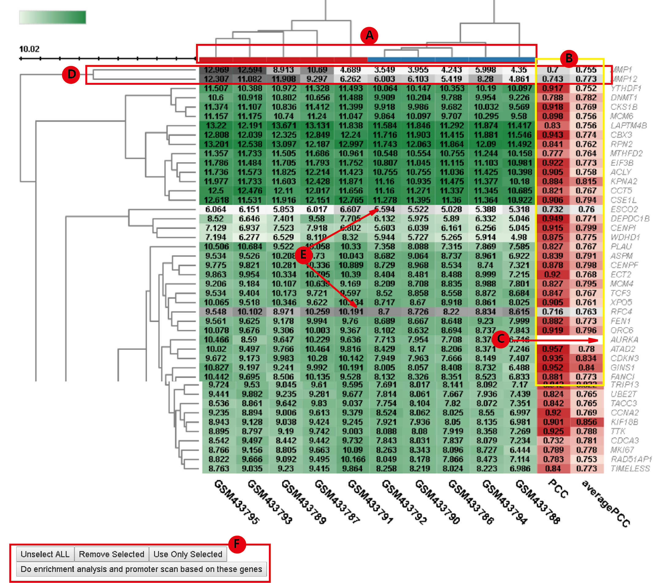
After applying a hard threshold, user can further view the heatmap of these genes' expression in each dataset by select the corresponding dataset in Show Heatmap dropdown menu(C).

In the heatmap, the column color code shows the sample grouping where red means tumor and blue means normal(A). The two columns of sidebars to the left of heatmap provide PCC in the current dataset and the average PCC across datasets of the gene in the row with the gene of interest, respectively(B). The row with blank PCCs is the gene of interest(C). User can further filter the gene list in the heatmap, interactively. Clicking the branches of dendrogram can select (or unselect if have been selected) genes in the branch(D). Similarly, Clicking a single row can select (or unselect if have been selected) genes in the row(E). User can then use only the selected genes or discard these genes in the following enrichment analysis(F).

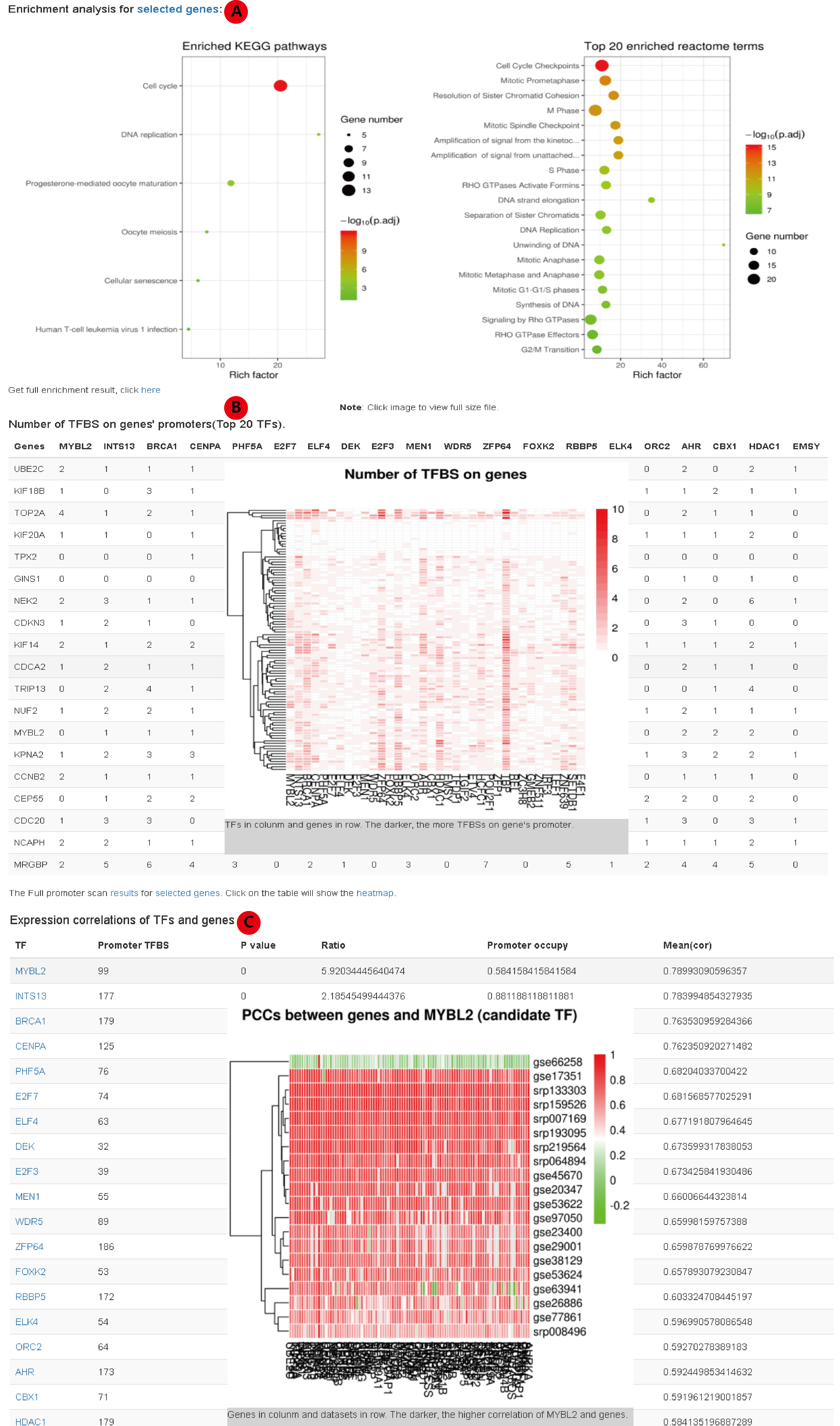
After filtering highly correlated genes, we further provide functions to do enrichment analysis and promoter scan. We provide KEGG enrichment and reactome enrichment using clusterProfiler R package(A). For promoter scan, we take use of the ChIP-seq data from GTRdatabase. The enrichment of transcription factor binding site (TFBS) for the set of genes is determined by 1000 bootstrap experiments. The p value of a TF determined by the number of experiments with equal or more TFBS on promoters than that on interested genes' promoters. The ratio is tatio of the number of TFBS on the interested genes' promoter to the average number of TFBS in the 1000 times bootstrap experiment.
Candidate TFs are those with: p value < 0.05, ratio > 2, occupies 30% of interested genes' promoters and the average PCC between TF and interested genes > 0.5.
In the result page, we present the counts of TFBS for each candidate TF on each selected gene (top 20 at most, the full statistics is available as text). Clicking the table will present a heatmap to show the number of TFBS of each candidate on each interested gene's promoter(B). Clicking the plot or the table again will hide the plot. The following panel provides correlations between candidate TF and interested genes(C). Clicking a row will present heatmap of PCCs between corresponding TF and intereted genes in all the dataset.

Summary pages
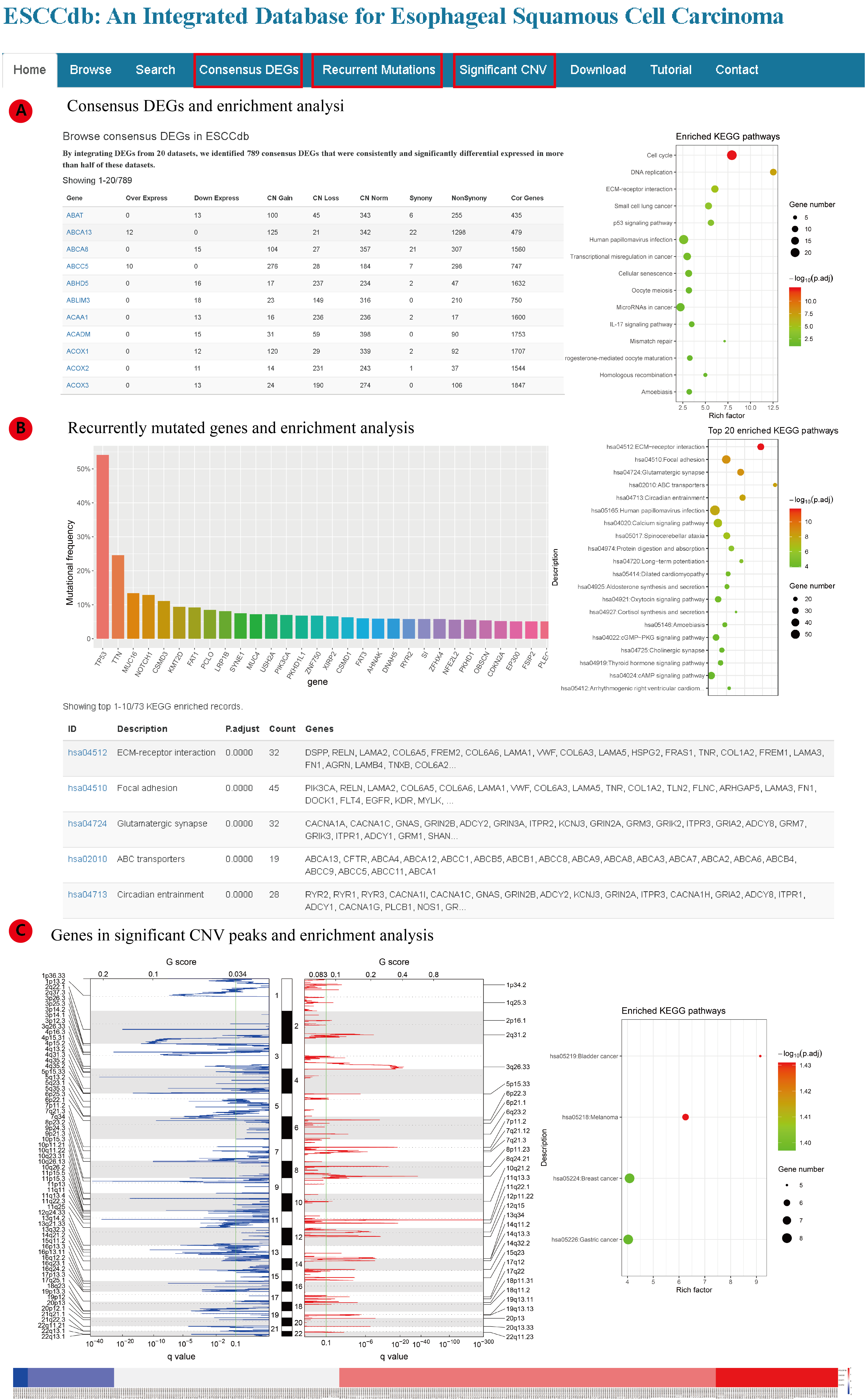
To better understand the data, we also provide three summary pages (figure): a) Consensus DEGs; b) Recurrent Mutations; c) Significant CNVs.
In Consensus DEGs page (A), we identified 789 consistently up/down regulated genes in ESCC supported by more than 10 datasets (>50%). Then KEGG and Reactome pathway enrichment analysis is also available. In Recurrent Mutations page (B), the genes mutated in more than 5% ESCC samples are listed first. Then for genes mutated in more than 1% ESCC samples, we carried out KEGG and Reactome enrichment analysis. In Significant CNV page, GISTIC2.0 identified significantly gain/loss peaks are shown, the copy number of each genes in the peaks are presented as heatmap. KEGG and Reactome pathway enrichment analysis were carried out for genes in gain or loss peaks.
